
I’m the Chef Too! Website with E-Commerce
Completion Date
July 2020
Services Performed
Custom Website Design with Promotional Video
WordPress Website Build
Custom Dynamic Forms
Social Media Integration
Custom Webstore Development
Specialty Shipping Implementation
 Project Description
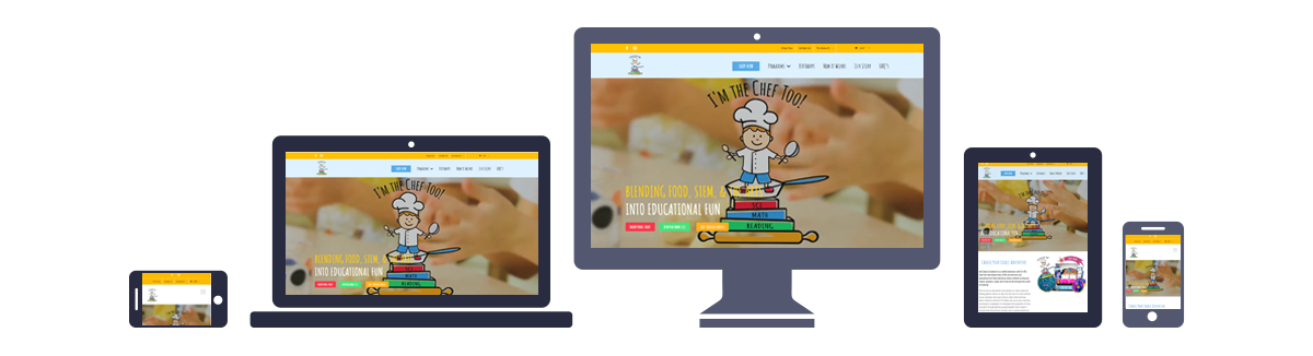
I’m the Chef Too! came to Rosie’s Creative hoping to create an attractive website capable of supporting brisk sales of their mail order kits as well as promote their educational classes. As an expansion of their popular classroom cooking sessions, especially launching during the quarantine period, I’m the Chef Too! needed to be able to launch their mail order service as quickly and seamlessly as possible. The role of Rosie’s Creative was to create a mobile-friendly, fully expandable website with a custom webstore and shipping implementation with room for growth to include future expansions of the product line without sacrificing speed and information flow.
Through our initial consultation and our discovery process, Rosie’s Creative decided that a website built with WordPress would be the best way to meet the client’s needs. They wanted to create a cutting-edge website that provided a smooth, easy-to-navigate functionality that allowed users to feel engaged and excited without distraction. Our ultimate goal was to be able to create a feeling of excitement and play, with an intuitive progression from introduction to purchase. It also needed to be attractive and mobile friendly, as families (especially busy parents) tend to access websites via their phones while multitasking. We opted to use WordPress because of its expandability, its mobile responsive features, and its built-in SEO benefits, among other reasons. We built the new site using a fully custom theme designed to accommodate future growth without sacrificing current functionality.
I’m the Chef Too! wanted their website to lead through excitement and engagement at kid level, for educational fun with food, STEM, and the arts. The key to evoking that feeling was to create a navigation menu that was clear and easy to follow, based around simple terms that kids of any age might be able to understand. We also kept the navigation as instinctive in its flow as possible, with an almost step-by-step left-to-right flow. The overall website was built to handle the client’s expanding list of programs and kits, with room built in the back end for new sections to be added as needed. This type of forward-thinking design optimizes the parameters of current technology to keep a website looking great and performing well for years to come. The webstore was developed and integrated with the site to provide a seamless transition from information to direct sales, with specialty shipping implemented to ensure timely and satisfactory delivery.
To create the unique kid-focused look of this site, our graphic design choices focused primarily on kid-friendly icons and animated word bubbles, in combination with the logo we developed with the client featuring a cartoon-style child chef. Using that logo and a targeted brand design discovery process to hone that aesthetic, we dialed in the final color palette to make focused use of primary yellow, red, and blue colors to highlight the primary school audience and underline the educational focus of the programs and products. The goal is to provide an engaging visual experience that feels both playful and educational. Typeface selections were made with a focus on continuing the theme of childlike play, using an easily readable printed handwriting font for headings and easy-to-read sans serifs throughout the site.