Pro Bono Counseling Project
Completion Date
March 2019
Services Performed
Custom Website Design
WordPress Website Build
Custom Dynamic Forms
Social Media Integration
Client-Maintained Website
Project Description
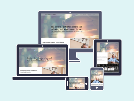
Pro Bono Counseling Project came to Rosie’s Creative looking for help in modernizing their web presence and branding. Prior to contacting us, their previous website was extremely out of date. It was not mobile friendly and did not leverage SEO. Our role was to give them a modern website that was fully expandable and could be grown well into the future of their organization. Additionally, they were looking for a firm that they could develop a strong working relationship with to grow their online presence.
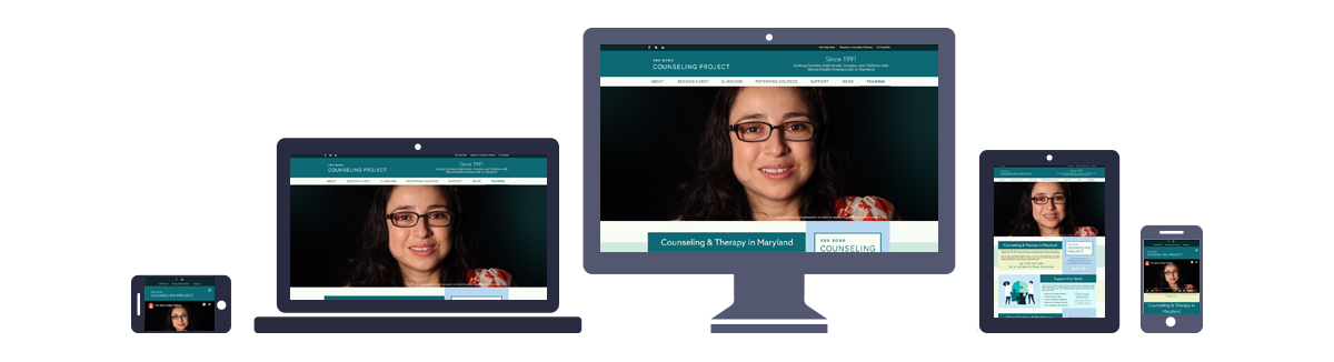
Based on the results of our initial consultation, we decided that a website built with WordPress would be the best way to meet the Pro Bono Counseling Project’s needs. In order to have a modern and relevant web presence, the new website needed to be attractive and mobile friendly, able to convey essential information to their target audience without too much distraction. We opted to use WordPress because of its expandability, its mobile responsive features, and its built-in SEO benefits, among other reasons. We built the new site using a fully custom theme designed with future growth in mind.
The Pro Bono Counseling Project wanted to effectively communicate their mission and had a professional quality video that communicated that mission loud and clear. Therefore, we decided to put that video front and center in their new website’s design. Today’s mobile technology is now robust enough to handle video, whereas even a few years earlier this was not the case. This is an example of forward-thinking design that moves with technology trends to keep a website relevant.
When making our graphic design choices, we referred to the organization’s existing logo as our primary source of inspiration. With that as a base point, we conducted a brand design discovery process to select the final color palette. The website’s color scheme pulls from the logo and expands on it, combining teals, oceanic greens, and a soft yellow and white highlight to project an image that is soothing, yet professional, to reflect their commitment to mental and emotional wellbeing. Typeface selections were made with a focus on readability and accessibility, using clean, modern sans serifs throughout the site.