
The Language of Color
Understanding the Connotative Meaning of Color
A powerful tool for conveying meaning and evoking emotion, color is a crucial component of establishing your brand’s visual identity. But why do certain colors elicit such strong reactions? Understanding the answer is key to choosing the right color palette to represent your brand.
Embedded in every color are layers of connotative meaning, linked to history, symbolism, and culture. And when creating a palette for your brand, it pays to be mindful of the meanings associated with different colors.
Let’s go around the color wheel to see how different colors are commonly perceived in Western cultures, and how this affects their use in branding and marketing…
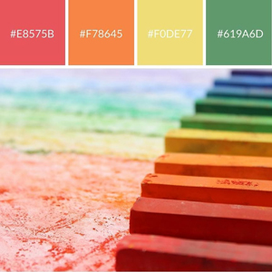
Red
Symbolizing vigor, power, and passion, red evokes a range of strong emotions, from love to anger. Designers often use red to suggest motion and energy, or to draw attention and communicate urgency – for instance, when advertising a big sale, or creating a call to action.
Orange
Combining the high energy of red with the more playful qualities typically associated with yellow, orange symbolizes excitement, enthusiasm, and warmth. Like red, it’s often used in calls to action to create a sense of urgency. It’s also a solid choice for earthy, autumnal color palette, since it suggests imagery of fall foliage.
Yellow
Cheerful, bright, and energetic, yellow exudes optimism and youthfulness, and can add a touch of whimsy to any color palette. Using yellow as a main brand color can be a risky move, though, because it can be overwhelming in large doses, and it’s often considered a “juvenile” color.
Green
A popular brand color across many industries, green has a wide range of connotative meanings. It can symbolize growth, health, and nature – or money and wealth. Popular with brands in finance, real estate, and lawn care, green has also become identified with environmentalist causes in recent years.
Blue
The color of sea and sky, blue is as ubiquitous in branding as in the natural world. Symbolizing peace, stability, clarity, and integrity, blue is used by brands in a wide range of industries – from communications and technology, to finance, health care, and transportation – to communicate a sense of security and reliability.
Purple
Historically associated with royalty and romance, purple is a bold choice for brands looking to create an aura of mystery and sophistication. And since it’s seldom found in nature, purple can be used in symbolic contrast with more earthy tones to add a sense of adventure to a color palette.
Are you undertaking a branding or rebranding project, and looking to make a big impact with color? Rosie’s Creative is here to help. Contact us today, and let’s get started. We’ll put our heads together and find the perfect way to tell your brand’s story and capture the imagination of your target audience – using the language of color.