

Rounding Out Your Palette: 6 Basic Color Schemes
Color Palettes for Communication
When setting out to establish a distinctive visual identity for your brand, choosing an appropriate color palette to communicate your core values and attitudes to potential customers is a vital first step.
Think of the image you want to project. Is it calm and steady? Brash and confrontational? Quirky and vivacious? Whatever the answer, your choice of colors and how they come together into a cohesive palette will bring your brand story to life in vivid fashion.
But what goes into the process of creating that perfect color palette? Well, designers don’t simply group colors together at random. Instead, they rely on their knowledge of color theory and time-tested design principles – specifically, an understanding of the color wheel and how specific groups of two, three, or more colors relate to one another.
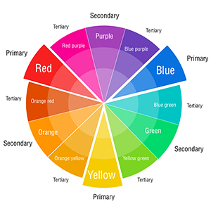
Let’s take a quick look at six basic color schemes:
Monochromatic
A color scheme that uses tints, shades, and tones of the same base color alongside black and white to create a simple, elegant look.
Example – white, pink, red
Analogous
A natural and harmonious color scheme built with colors that are next to each other on the color wheel.
Example – green, blue-green, blue
Complementary
A high-impact, high-contrast color scheme that uses colors opposite one another on the color wheel to create a bold, attention-grabbing look.
Example – orange, blue
Split-complementary
A three-color variation on a complementary color scheme that uses the base color alongside the two colors adjacent to its complement.
Example – orange, blue-green, blue-purple
Triadic
A color scheme using three colors that are evenly spaced around the color wheel to create a rich yet balanced palette.
Example – orange, green, purple
Tetradic
A four-color scheme that uses pairs of complementary colors to create a vibrant and energetic palette that spans the color wheel.
Example – orange, yellow, blue, purple
This isn’t meant to be an exhaustive list of potential color combinations, of course. But the underlying principles that make these six basic color schemes successful are the foundation of any designer’s strategy when working with color.
Here at Rosie’s Creative, we’ve got the knowledge and experience to bring any brand story to life with a color palette tailored to your needs and aimed at your target audience. So, if you’ve got a branding or design project on the horizon and you’re interested in learning more about our approach can deliver results for your brand, contact Rosie’s Creative today.