Typefaces & Fonts: Free or Paid? 4 Key Points to Consider
 For brands today, a standout visual identity is essential to reaching target audiences and gaining a foothold in a tough marketplace. And one key aspect of visual identity is your choice of brand typography.
The right typeface can communicate the character and values of your brand like few other things can – while one that’s poorly chosen can muddle your message like nothing else. You’ve got many factors to consider when choosing a typeface, and high on the list is the question of whether to use paid or free typefaces for your marketing efforts.
So, which is the better option? As is so frequently the case, there’s no one-size-fits-all solution – the answer depends on your brand’s unique situation and what you’re looking to achieve. Let’s take a closer look…
For brands on a budget, free typefaces can be a perfect fit
We’ll start with the obvious – for startups, small businesses, and local nonprofits, every dollar counts. And paying for type can add hundreds of dollars to a marketing budget, especially if you want the full range of weights and styles available within a given typeface. If you’re not in the position to make that kind of investment, free typefaces can be a great alternative, helping you achieve a professional look without breaking the bank.
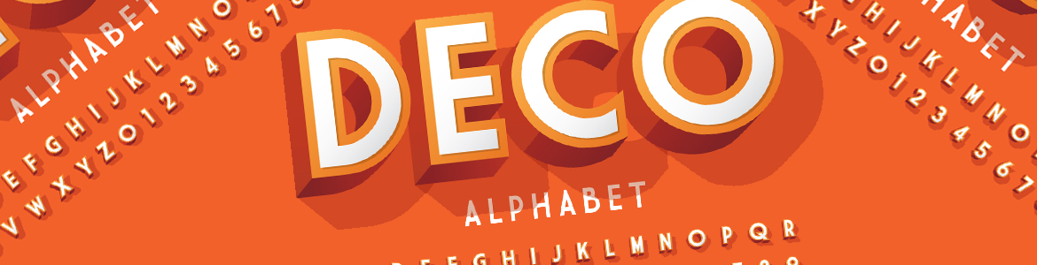
Paid typefaces are generally more high-quality and versatile
When you pay for a typeface, you’re paying for the skill and attention to detail that a professional type designer brings to the table. Many free typefaces, on the other hand, are made by amateurs or hobbyists, and it shows – look out for inconsistent letter spacing, missing glyphs and special characters, and a limited selection of weights and styles. Broadly speaking, paid typefaces are of higher quality and usually won’t have these issues.
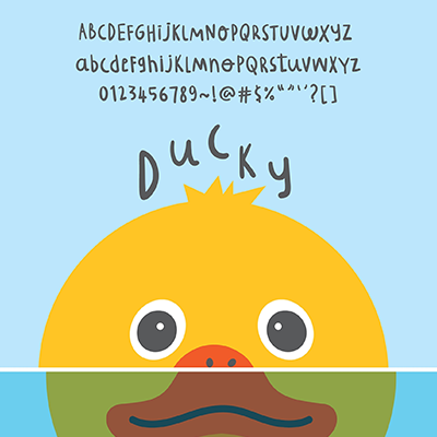
However, there are still some terrific free typefaces out there
Of course, this isn’t to say there aren’t some outstanding options when it comes to free typefaces. While many are indeed the work of amateurs, others are made by legit design pros who have embraced the open-source philosophy and chosen to make their works open, shareable, and free. Just be prepared to wade through a lot of junk before you get to the good stuff, especially on some of the bigger, more popular websites for free type.
Whether paid or free – read the fine print!
Another big factor to consider is the question of licensing. This is particularly relevant when considering free typefaces, as many are licensed only for personal use, making them a no-go for commercial projects. Even with paid typefaces, it’s important to review license terms carefully – you’ll sometimes need a separate license for web and print applications. As always, reading the fine print ahead of time can help you avoid big trouble down the road.
Are you ready to learn more about how Rosie’s Creative can help your business or nonprofit achieve a standout visual identity with elegant, eye-catching brand typography? Contact us today – and let’s get started! Remember, with Rosie’s Creative, your first consultation is always free!